

The above image illustrates what is called “Mercator Projection,” created in 1569 and named after Gerardus Mercator (1512-1594). On the right is the standard view we get from flat maps. But true map coordinates are based on a circular globe, so that longitudinal lines approach one another in distance until they meet a the poles. By making them equidistant on a flat map, we distort the size of landmasses closer to the equators. See how, on the map above, Greenland appears larger than Africa. In reality (unless you are a flat earther, in which case, vamoose!), Africa is fourteen times the size of Greenland. This explains why when we flew to Nairobi last year it took nine hours from Paris. The two places appeared much closer on the map.
The explanation for this is that Mercator projection is more practical for navigation on the high seas, giving better angles … I’m repeating what I read and don’t really get that, but accept it, as Mercator maps are all about and in use.
Below is a map of the world (right side up, of course, as if such a thing existed). You can see the distortion caused by Mercator in the relative size of all of the mapped lands versus the globular size inserted in dark gray.
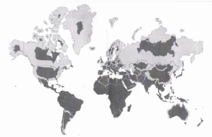
Thus are Africa and South America monstrous in size compared to the US.
________________________________
Just for fun, I grabbed two videos the other day. All I ask of the reader is to 1) enjoy the music, 2) tell me if it is Paul or Mike performing, and how you distinguish them (or are they both the same person?), and 3) see if you can find any subtle hints of either lip syncing, ghosting of instruments, or Autotune.
I’ve not spent much time with this, and have my Paul and Mike lined up in my mind based on a glance.

I’m not unaware of the distortion, but those do a great job of illustrating it.. may post to fb, people enjoy being reminded how effed up their perceptions are –
And on the rationale for it – well yes that may be, but – how many of us are high seas navigators?! Wouldn’t we be better served by a more roughly accurate depiction of scale. I guess “they” just like to eff with people –
LikeLike
That second map is not correct either, it is excessively distorting the size of the northern countries to make them look too small. Russia is enormous, almost twice the size of the United States. Canada looks way too small – it is bigger than the United States. Also the US is 5x the size of Mexico, on this map Mexico looks 1/2 the size. Also Australia is significantly smaller than the US, but looks the same size.
LikeLike
I have a globe in my office and will have to spend time with it in this manner to decide what I think of all of this. I do know that all through my formative years I thought Greenland to be immense and wondered why it was not labeled a continent. This Mercator puts that in perspective. It is mostly ice sheet, part of the northern pole, as Antarctica is for the other end.
Another thing, unrelated, but which people take umbrage to … Europe is not a continent. It is a large peninsula of Asia. People come up with all kinds of social and geographic reasons to call it a continent, but if it is that, so too are India and Indochina.
LikeLike
There may be some distortion in the map I presented, as apparently the person constructing it was merely moving things around on a computer screen. On my globe, Russia is indeed twice the size of the US. Mexico appears to be maybe a third the size of the US. Australia is smaller than the US, but not by much.
Try it out on any globe you find, as all modeled globes by definition eliminate the Mercator effect. Some are more accurate, some are, like mine, less trustworthy, as they are cheap to buy. Mine was a Christmas gift.
LikeLike
Yeah your assessment sounds right. Its amazing how much “shrinkage” the northern counties of Canada and Russia get as compared to a Risk style map of the world. Maybe it’s the cold water, George Castanza would understand.
LikeLike
Nice reference.
LikeLike
I have a possible link to one of your twin posts . Not sure how to contact you and would rather not post h in case it’s bollox 😅
LikeLike
Contact me via email mpthct@proton.me
LikeLike
I did have to go through the twin posts long ago to get rid of “bollox”, as you say, and decided on the ones kept that they had to be different enough that the difference was easy to spot (Joplin, McCartney, Anderson Cooper, a few others), or there had to be a photo of both of them together (Rihanna, Drake, a couple of others). With the rest that I discarded, well, I was young and new at the game.
LikeLike
The “Long Tall Sally” film looks to me like Paul. I think I can see the tooth abscess or whatever its called.
LikeLike
Thanks for the comment, and you certainly could be right. I did not notice the teeth so much as the habit, ingrained, of original Paul to move his head as he performs. On the other hand, the other “Paul” (Mike, in my view) brings far more energy and a voice that is perhaps half an octave higher in range. He’s a good stage performer. I could not make out enough of the eyebrows to see if “Paul” had the wraparounds. Easy to trim.
Someone, I think Tyrone, commented one time that during Wings intermissions, “Paul” would come out, sit on a stool, and croon some of the band’s slower-moving hits, Yesterday, For No One, etc. That would be a very taxing show for any single musician, not to have a break, and my (and I think Tyrone’s) assumption was that Mike was there for Wings, and Paul for intermission.
In the early days, they look enough alike that is indeed hard to tell, but I think energy level brought to the performances by Mike, and the higher vocal range, made him the permanent Macca. Views differ. I’ve done enough of this nonsense to have faith in my own views, but also been wrong enough to listen to others.
LikeLike
Mark, to the non-initiated ie. non Beatlemaniacs,,s, can you please clarify who came first – was Paul an original member and they added Mike later? The “Paul” vs Paul is extremely confusing. You need a better way to distinguish one from the other.
Do you think they added this other “twin” or cousin later when the Beatles took off? Or was it all planned from the beginning? Brothers are often not distinguishable from twins, so they could just be brothers vs actual twins.
LikeLike
Go to Sir Faul, https://pieceofmindful.com/2022/05/03/sir-faul-2/. Scroll down to “Main characters”, not too far down. There you will see photos of Paul in 1957 and Mike in 1959. They would have both been in Hamburg, starting 1960, which is where they were in training. After they got their start, got famous, it was mostly Paul doing the stage work, as Mike did not know how to play left-handed. There were performances there they were ghosted or lip synced, I suppose, allowing Mike stage time. But mostly Mike was used for interviews and photo shoots and the like. He was in both A Hard Days Night and Help, in the former often wearing a fake mustache to disguise him a bit, part of the plot, and they used camera angles so that he was never seen actually playing left handed. But if they were actually visibly and really playing instruments, it was Paul.
Later, after they quit public performances, they would do occasional videos, mostly lip synced, but they would put Mike as Paul on a piano with his hands not seen. Eventually he would play guitar and bass left-handed, which is indeed impressive, in my view.
So both were there from the beginning. I also did a lot of work on Lennon, and there was a set of twins there, but I could never find anything convincing that there were two of him in the band. I was just and am sneaky suspicious.
LikeLike