
I have lamented at times that people in this land do not know how to read and interpret graphs. Indeed, some can be confusing and intimidating. Take, for instance, this one, called the Palmer Drought Severity Index, which is maintained by NCAR, the National Center for Atmospheric Research, just down the road from us in Boulder.
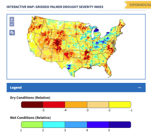
How to read: Dark brown is severe drought going on as we speak. That middle state there is Colorado, where I live, and I think it reflects the fact that we had very little snowfall this winter, so little in fact that thousands of people cancelled winter skiing vacations here. That happens on occasion, from what I read, maybe ten years out of the last 100 have been as bad or worse. Take a look, however, at the bottom point of Nevada, and the Utah/Arizona border. That would be the location of Lake Mead and Lake Powell, and the Hoover and Glen Canyon Dams. I keep reading where these two locations are undergoing record low water levels … in fact, that is why those dams were built, to store water in a drought-prone area.

Naturally, we’re told that the current drought is the cause of historic low levels for Lakes Mead and Powell, and that it is catastrophic and that it is caused by Climate Change. Catastrophic would indeed be the case until such time as people in that area stop with the drawdowns. The Climate alarmists do not take that into account, that Las Vegas inserted a “third straw”, a tunnel to draw water from Lake Mead from underneath the reservoir. The cities of the Southwest, including Phoenix, Los Angeles, Las Vegas and Tucson, in fact, 40 million people, depend on the Colorado river for water sustenance. If you look at Colorado on this map, you’ll see a current part of the problem, lack of snowpack in the Colorado Rockies. The rest … is overuse. Drought? It comes and goes, always has. Climate change? They have no evidence to back that claim, but then, they’re the Climate Alarmist crowd. They don’t need it.

Droughts are a fact of life out here in the west. I am hopeful as I see all the flooding going on in so many places, including Phoenix itself, that the current very powerful La Niña will circulate some moisture our way. Things never really improve until things are looking really, really bad.
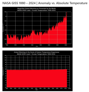
Above is a fun graph, showing how they like to alarm us with things that are not alarming at all. Notice how NASA GISS, the Goddard Institute for Space Studies, in the upper graph has taken the mild warming we have experienced since 1880, which falls between 58° and 60° degrees Fahrenheit, and expanded it and colored it red and gave it a pointy surface to make it seem like the fires of hell. That is just how propaganda is done, how they try to insert alarm into everything, even a mild temperature increase. That is how they lie with graphs.
The bottom graph is the very same data, but scaled differently. Thanks, by the way to NASA, who was also very straight with us about those Moon landings too. Lying is just not in their makeup.
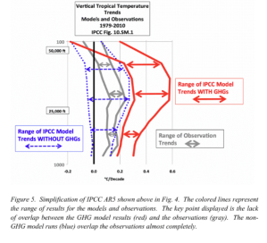
OK, I hate it when they do this, as they can make simple things so confusing. Above they have taken an IPCC graph of temperatures and turned it on its side. So twist your brain sideways to understand it. It is a graph of temperatures, the X axis, which runs left to right on the bottom, shows the temperature increase during the timeframe 1979-2010. Here is the key: The IPCC, the Intergovernmental Panel on Climate Change, is showing us the blue and red of this temperature chart. The red is NOT actual temperatures, as they would lead us to believe, but projected temperatures from climate models they use instead of real data. The blue lines are the IPCC’s view of what temperatures would have been during that time without the effects of greenhouse gases. Superimposed on that, and not by the IPCC, are the gray lines, which are actual observed temperature data from weather balloons and satellites.
Why, it is as if GHGs have had no effect!
What IPCC wants us to believe by this graph is how much hotter it was from 1979-2010 due to greenhouse gases. What they inadvertently showed us is how actual temperatures act as if GHGs are having hardly any effect!
Here’s another graph:
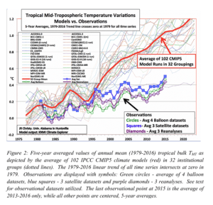
This one has been around for a while. What it shows us are those IPCC Climate models, the spaghetti lines above, and actual observed temperatures from weather balloons (green), and satellites (blue). Here’s what is really crazy: The IPCC, and all of the countries of the world which subscribe to its data, base actual climate policy on the models! Reality took a hike there, long, long ago.
Now, this last graph below is going to take some explanation. At the very end of this post are the CVs of the two gentlemen who prepared it, Richard Linzden, an atmospheric physicist, and William Happer, a physicist. I do this to embolden the case they are making, as shown on the graph. It is very important.
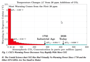
What these two men are telling us is that CO2 does have warming power, but that the first 20ppm (parts per million) in the atmosphere have the most, and that its warming power diminishes rapidly after that, so that today, in 2026, it is having hardly any warming effect on the planet! In fact, they say, CO2 has not made anything more than a tiny impact on global temperatures since 1750.
It is my belief that the Climate Alarmist movement is nothing but propaganda, but that it is so powerful, so well financed, that it has the ability to change all of our perceptions about a harmless fertilizer gas that helps us grow better crops, making it appear to be a monster. They dominate the media, an effect that CIA once referred to as its “Mighty Wurlitzer“. Every climate scientist, every government agency, every news outlet spout the nonsense that CO2 is a planet-killer, and that our use of fossil fuels has to end!
Can you see, as I so easily do, that it is ALL fake, and that there is an ulterior motive? As in … misanthropy?
______________________
CV’s of Richard Linzden and William Happer:
Richard S. Lindzen is an American atmospheric physicist and Professor Emeritus of Earth, Atmospheric, and Planetary Sciences at the Massachusetts Institute of Technology (MIT), where he served as the Alfred P. Sloan Professor of Meteorology from 1983 until his retirement in 2013. He holds a Ph.D. in Applied Mathematics (1964), an S.M. (1961), and an A.B. in Physics (1960), all from Harvard University.
His academic career includes positions at Harvard University (Gordon McKay Professor of Dynamic Meteorology, 1972–1982), the University of Washington, the University of Copenhagen, the University of Oslo, the National Center for Atmospheric Research, and the University of Chicago. He is a member of the National Academy of Sciences and a Fellow of the American Academy of Arts and Sciences, the American Association for the Advancement of Science, and the American Geophysical Union.
Lindzen has published more than 200 scientific papers and is known for his work in atmospheric tides, ozone photochemistry, and the Iris hypothesis. He received the AMS Charney Award (1985), the AGU Macelwane Medal (1969), and the AMS Meisinger Award (1968). Since 2013, he has served as a Distinguished Senior Fellow at the Cato Institute and has been associated with the Heartland Institute and the Annapolis Center for Science-Based Public Policy.
William Happer is the Cyrus Fogg Brackett Professor of Physics, Emeritus at Princeton University, specializing in atomic physics, optics, and spectroscopy. He holds a B.S. in physics from the University of North Carolina (1960) and a Ph.D. in physics from Princeton University (1964).
His career includes significant academic and government roles:
-
Academic Tenure: He began at Columbia University in 1964, serving as Director of the Columbia Radiation Laboratory (1976–1979), before joining Princeton University in 1980 and retiring to emeritus status in 2014.
-
Government Service: He served as Director of Energy Research at the U.S. Department of Energy (1991–1993) under President George H.W. Bush, overseeing a $3 billion research budget. He later served as Senior Director of Emerging Technologies at the National Security Council (2018–2019) in the Trump administration.
-
Advocacy: He is the Chair and Co-Founder of the CO2 Coalition, where he advocates for views that atmospheric CO2 levels are beneficial and that climate change poses limited risk.
-
Innovations: He invented the sodium guide star for astronomical adaptive optics and co-founded Magnetic Imaging Technologies Inc. to develop hyperpolarized gas technology for MRI imaging.
Happer has published over 200 peer-reviewed papers and received numerous awards, including the Davisson-Germer Prize (1999), the Broida Prize (1997), and the Frederick Seitz Memorial Award (2015). He is a member of the National Academy of Sciences and the American Academy of Arts and Sciences.


The problem with investing your time and effort and writing about a subject such as global warming is: Either we already know you are correct, pretty much everyone reading this. Or it looks too hard to work out we have to trust the experts most of the world. Of course there are a few young people still learning but in general it’s pretty stagnant now.
This seems to apply to writing about almost any topic. I guess that’s why sports and politics and wars etc are so popular.
LikeLike
I hear you … I do tend to drill deep on this stuff. I think today was a worthwhile effort … and I needed to do it for my own clarity of thought on the subject. As I have said many times, I think with my fingers on the keyboard, and just read along as I write, so I have to air it out.
I started out with a modest objective, to show that the Southwest is not suffering drought so much as overuse of the Colorado River, which is not the gift that keeps on giving. The fact that Las Vegas had to put a tunnel underneath Mead to continue its supply tells us that we had reached a limit for that river years ago. They had to do that because they knew the water level could not sustain over-the-top supply.
But then I got going on other stuff, and I remembered a graph but not where I got it that showed that CO2 does not even cause warming. That’s my good luck this morning in that I found the Linzden Happer graph, in which Linzden, an atmospheric physicist at MIT emeritus, meaning he’s retired and so can speak out, says that it is well understood among scientists of his ilk that warming caused by CO2 declines logarithmically, so he and Happer did the math, and found out that where we are at, and where we have been since 1750, is that CO2 has no effect on temperature, and the other trace greenhouse gases are too small to matter. Climate Change is a fraud.
In other words, game, set, match. They have been lying from the beginning about Global Warming/Climate Change, and I have to think the powerful forces behind it, the people at the top, anyway, know this, and have known it from the beginning.
That to me made the effort behind this post worth my while. But you know, the game goes on. From this point on I will tell the skeptics to stop leading with their chins, to stop saying up front that they know CO2 causes warming. They don’t know this, so they need to lead with a roundhouse punch, and say what is true, that CO2 has no effect other than to enhance our food supply.
LikeLike
What always irritated me about the climate change obsession, long before I knew it was BS like you, was the myopic feel good nature if the psyop, in comparison to reality.
Now i had meant to comment on your previous post about the eco-terrorism movement, or so called. Inthe 1990s me and my friends were into that stuff- reading about it, talking abput it, since I hated development and the modern world in general, and preferred hiking, gardening, and biking to anything back then.
So in graduate school I actually joined the group zero population growth . I remember the 6 billion pins they had like that was going to be the end of the world. So I do sympathize with the efforts at population reduction, in a philosophical way, although it has been done in a completely underhanded way, because they know the average person would not change their habits based on reason. And of course most of these psyops are unnecessary, only needed because of the greed and need for control by the elite.
LikeLike
What i mean about climate change being a feel good virtue signaling psyop, was it gave white guilt types a reason to buy a more expensive product on the virtue of saving “carbon”. And so that living in a plastic apartment in the city would seem like the right thing to do, and that you should pay a million dollars to live in green luxury.
LikeLike
I have also sympathized with population control except that to achieve it is Pandora’s box. Generally it happens itself along with increased wealth and comfort. There’s no more need to have kids to make it through life and have a comfortable old age, so we stop at two or three. This is Western Europe’s situation, that they’ve become so used to easy lives that they import people to do the essential chores. It helps that the imported people are of Middle East descent, and have character and abilities. But the residents carp and complain. Like here.
And anyway, I’ve no clue of the population of the planet, and that information is not broadcast that I can tell.
LikeLike
Part of the problem with teaching people to think illogically is that they will struggle to use logic when you want them to. Then deception becomes a requirement.
Im a hundred percent behind the global warming scam and moving pollution away from where I live. I was happy to loose my job to this end but most were not.
Many other scans I’m not in support of. But I appreciate managing the world is difficult and if we are to believe that 5 percent are socio or psychopaths they have to be accounted for in the system and probably given a lot more consideration than average Joe.
LikeLike
What I’m probably trying to get at is: Everyone that develops a decent sized audience in the conspiracy field follows a bit of a pattern.
No1 they start behind or level with most average conspiracy theorists. You are too far ahead on global warming.
No2 they hit whatever is popular at the time. I’m not sure global warming is anymore.
No3 they are flat earthers or religious and talk about the creator as if it’s a given. Certainly not something you do.
I agree with your assesment on global warming and drought and water use in the main. I’m really trying to work out if I can be bothered writing and how to go about it.
I also agree with writing for yourself and much prefer to read writing of that style but I’m not sure many other do. People here being an obvious exception.
LikeLike
I thank you for your tolerance. My life, like most everyone’s, is pretty mundane, though at an advancing age I still take pleasure in hard work and silliness like the gym four times a week. I long got over the notion that people can be reached or opinions changed. But I do enjoy figuring things out, and stumbling on the Linzden Happer work brought me a sense of relief that I had not only figured out the game, but was looking at proof. I rarely use that word.
I knew a guy in Montana, an arrogant prick, and he continually indulged in self praise, imagining himself like Don Quixote. He was mean and arrogant, which masks insecurity, I now know. At that time the topic was 911, and he, being a book store clerk at MSU, said that it was all real, and further that the engineers and scientists there in that college were straining to understand what had happened, as Newton’s third law did appear to have been violated. He acted as if he was in consultation with them. At least I had a better grip on reality, and understood the power of TV to convey impossible feats to people of simple mind, not that they were not capable of better, but that they never needed to think better.
He eventually had enough, and retired from thinking about the hard stuff and became an NFL analyst, and made predictions every week based on overthinking. I guess it was revenge for his asshole sense of superiority, a silly narcissist, as he was quite mean to me and others, but I showed him in a comment that I could easily equal his prowess in predicting outcomes not knowing a thing about the players or teams. I too could achieve 50 or 60%.
That was a pretty damned small victory, but when we are up against such power in this crazy life, tiny victories are all we get! I do not have an inflated ego, and understand that people around me are smarter than me, and if not so, my own abilities would have me counting beans forever, as my occupation was CPA, and I slowly understood over time that all most of us CPAs are (very special bean counters), who passed that test, were doing was making order of chaos and acting as government agents making sure people paid their taxes.
LikeLiked by 1 person
I wrote many old friends off after the 25th anniversary of 9/11, based on the nonsense they posted on Facebook and Linkedin. The neverforget nonsense. I so wanted to reply sure never forget 9/11, how about never forget the Patriot Act, and the Iraq War, and War in Afghanistan? And at least hundreds of thousands of lives, no matter how you slice it, fake or real, there was real suffering and death from those wars. For what? Revenge? Like people from those countries were just pouring into the USA wanting to terrorize us. Not to mention the blood libel of Muslims from 9/11, which is likely the worst sin there is.
LikeLike
It can be very difficult to have discussions with people once you have some idea of the level of fakery in the world. I tend to try to look for a serious interest the other person has like cars or gardening and steer the conversation that way. I can then simply listen and learn. I really like the enthusiasm people have when it comes to their hobbies. Almost everyone knows a lot about something I know nothing about but would like to learn.
The thinking around heavily publicised ‘events’ is very emotional and tribal. Almost not realty thinking at all.
LikeLike
We were visiting relatives in Wilmington a couple of years back and took a Uber to the Philadelphia airport when we left. The driver and I talked sports the entire way, easy enough in a town like Philly, and I knew enough names and legends to keep it going. That’s the value of sports, to be able to connect with people.
LikeLike
I was in Philly last fall and found it very friendly, and I too know a lot about American sports. The name you need to know in Philadelphia is Bobby Clarke, especially with the missing teeth:
Bobby Clarke: 100 Greatest NHL Players | NHL.com
LikeLike
I have a hard time with hockey, even as our grandson now has been playing for 18 years and has college aspirations. I cannot keep up with the puck so that players moves and goals are always a surprise to me until I see the replay. They are so fast on ice!
LikeLike
Yes I was being a bit dramatic, exaggerating about writing my friends off. What I should have said was I am writing them off as a critical thinker for now, since they have shown a lack of capacity to reflect on the past, and see where we were fooled, as I was about 9/11 until late 2021. Although I suspected something was up early on, especially after Bush blithely started a war in Iraq with fake intelligence, I knew the government was capable of any kind of lie. I just didn’t think they would kill 3000 people to start a war, which we now believe was not the case.
9/11 is also very emotional and a popular heart string puller in Boston, where we staged a mini-sequel, that being the Marathon firecrackers in 2013. I don’t know what it is, but certain humans seem to like to be victims, and they know it.
I do the same thing as yourself with conversations, I steer away from discussing “news” or common topics and get them to talk about themselves, and their personal experiences. People reveal a lot more truth than any newspaper when you get them to drop their guard and talk freely.
LikeLike
If you can tip at 52.7 percent at the line you can make a lot of money gambling. The very best are around the 57 percent mark.
I studied accounting at university but never finished. One of my daughter’s is currently studying accounting and Law. I’m hoping with the advent of AI accounting and Law will both become more enjoyable to practice.
I believe football or ideally cricket would be fun to write about and analyse. The trouble would be not many people would want to read what I would want to write.
I guess that is always an issue. It’s not in any particular field it’s just if you spend a lot of time looking into something your level of knowledge increases very quickly above that of the average audience as do your interests in the field.
What sort of weights are you lifting Mark? I’m trying to get back into the gym and running but hate the feeling of being sore.
LikeLike
At age 76 I am engaged in resistance exercise to keep my upper body and legs strong … free weights and bar bells, arm lifts, pull-ups, leg lifts, pull-ups, pushups, and stretching lower back to allow me to bend over with ease. There’s a variety of machines to assist in all of this, and whole walls of weights from low to heavy … I’ve been at it so long I know what level to choose for each dead weight and machine. I guess the idea is to find a comfort level and then stretch it out, do a bit more over time to keep it stressful.
Dick Van Dyke is 100 years old and says he goes to the gym several times a week, and I imagine he’s doing the same, not body building, but body maintaining. I don’t plan on living to 100 but I don want to be in good shape as each age allows.
LikeLike