
This interview addressed below (link) is with Massimo Mazzucco, a photographer who, while speaking with an Italian accent, is very good at English too. Consequently, I can understand his words without the annoyance that comes with having to parse and think at the same time. His business is to debunk the debunkers – to claim that the moon landings were a hoax. There’s nothing new to discover, and no new ground broken, so Petra, our friend, please, this is not about that. I wanted to link to Fakeologist and Ab Irato since a while back I took a shot at Lynn Ertell, a regular there whom I find terribly annoying. This is a way of apology for me, to link to some of Ab’s good stuff.
So as not to single out Ertell, I am of a bent that very quickly gets annoyed at supposed experts on any subject who practice the art of obfuscation:
- Pose as an expert.
- Never answer a direct question directly.
- Control the forum. Interrupt as needed, talk over, misdirect, drone on endlessly.
- If you don’t like the question asked, answer another.
Continue reading “This is NOT about the moon landings! It’s about advertising.”
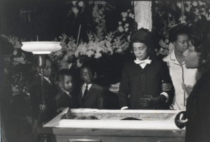
 I just clipped and saved the image to the left, and then when I went to download it to this post could not find it. Finally I traced it to a file in my photographs called “Family Photos”, and I was going to move it to another file and then realized, wait, that’s probably the right place for it!
 Piece of Mindful